


When you see clean and simple cards, what comes to mind? Elegant… or basic?
Clean and simple (CAS) design often gets labeled as beginner-level. If there aren’t multiple layers, techniques, and embellishments, it can feel too simple. In fact, it’s about making stronger design decisions. And that’s what builds creative confidence. You can check out more CAS ideas here.
Clean layouts can feel uncomfortable because every choice — colour, spacing, placement — becomes visible.
When a layout is busy, layers distract, and extra details compensate. When a layout is clean, your design fundamentals have to carry the card.
Watch the video to see how the card comes together
If a card feels slightly off, it’s often a balance issue. One side may feel heavier because of darker colour, larger image, or more detail. The instinct is usually to add something to the emptier side. What works better is adjusting the heaviness. You can shrink the focal image slightly, soften a layer, or shift placement slightly to quickly restore balance.
With CAS design, there are are three basic ways you can elevate your design without adding visual weight or clutter.
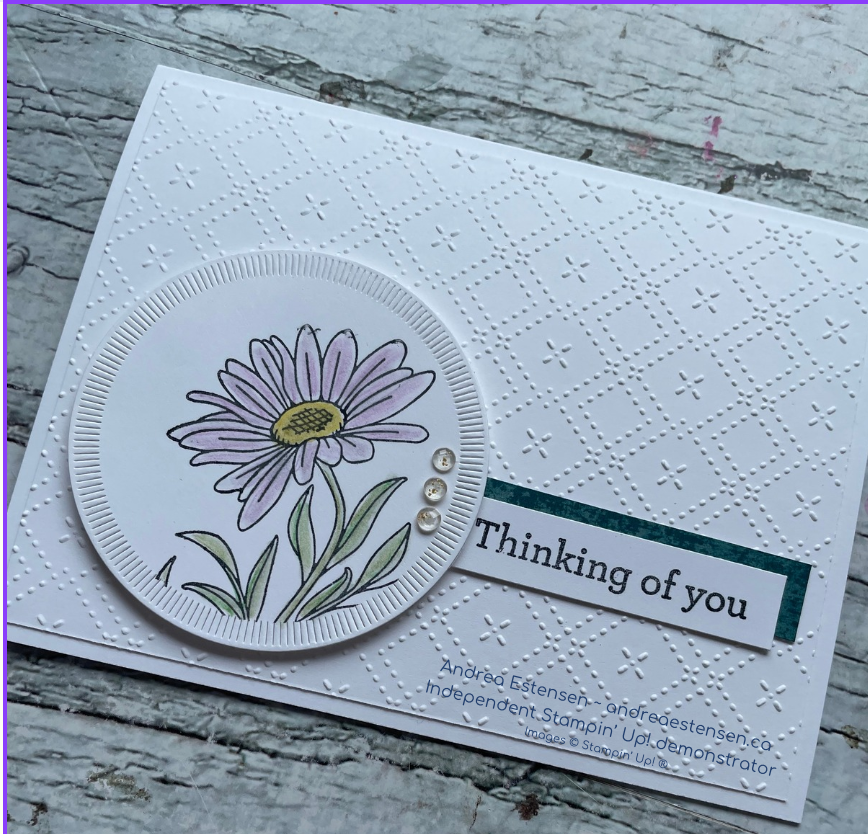
Colour pulls the eye to the focal image. That can be done by actually colouring the stamped image, adding a colour behind it, or anchoring with patterned paper. If that colour isn’t reinforcing your focal point, the card feels scattered. Keeping your highest contrast near your main image creates clarity immediately. When a CAS card feels chaotic, reducing the number of colours is usually more effective than adding another one.
White space is another key design element, but white space doesn’t mean it has to be white. It gives your design room to breathe, and gives your eyes somewhere to rest. Removing elements that make it feel cluttered usually improves the layout.
Texture keeps clean cards from feeling flat. Subtle embossing, raised panels, or dimensional elements add depth without overwhelming the focal point. In clean and simple card design, texture creates interest while maintaining clarity.
The layout in the video is intentionally restrained so these design choices stand out. The flower works because the background is calm. The embossed pattern adds interest without competing. Small orientation changes and placement shifts noticeably change the feel of the card — even though nothing dramatic was added.
These are the foundations of strong design. When you improve them, you stop second-guessing your layouts and start creating with confidence.
Grab the 60-Second Design Checklist to help you make clear, confident choices in your cardmaking.
It walks you through focused design questions so you can move forward in your design.
Let me know in the comments- do you love clean and simple, or is it a little scary?
