


Have you ever finished a card and something just didn’t feel right — even though everything was measured and layered carefully? You’re not alone. Let’s break down a layout that felt unbalanced, look at how to fix it, and learn simple design principles to avoid eye confusion.
Watch the video for the full before-and-after walk-through.
What Went Wrong — And How to Fix It
Sometimes a card doesn’t look unbalanced because of size, it’s because of visual weight and placement. Here are a few design principles I used to tweak this layout.
Visual weight matters
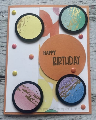
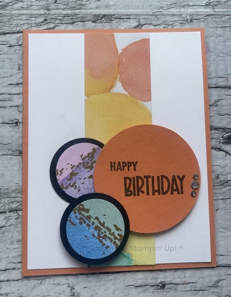
There needs to be a single focal point, so your eye knows where to look. The top card is fine, but the sentiment, which should be the dominant feature, gets lost with all of the colour and heaviness of the black layer behind the smaller circles.
Balance Is Not Always Symmetry
There needs to be visual interest across the card, but it needs to be cohesive. If elements are too clustered, or too spread out, it’s hard to focus your eye. There needs to be space to breathe.
Spacing and Alignment
If the elements of your design have breathing room, it improves the balance, and makes it look polished and professional. To get a sense of this, before you glue down any layer of the card, play with it first, to see where your eye lands, and how the design makes you feel. It’s much easier to add than take away- especially once layers are attached.
If you’re looking for ideas on layouts, click here for sketch ideas.
Want more thoughtful card design help?
Join my email list here https://bit.ly/PSDIYemail
